


A note before you read
The work shown in this case study was created independently, from scratch, as an original concept. It does not correspond to any client project or real commission. It exists to illustrate the methodology and design process I apply in the themed entertainment industry. All professional work developed during my time at Mycotoo is protected under strict NDA and cannot be shown publicly.
My background
I am a Senior Graphic and Motion Designer with 2.5 years specialising in themed environment design, working across five projects in Europe and the Middle East. Within those projects, my role was execution-focused: designing attraction marquees, wayfinding systems, posters, murals and print collateral, working daily alongside an Art Director who held creative oversight and narrative direction.
My contribution sat firmly in the graphic design and visual production layer: translating an established art direction into resolved, production-ready artwork. That process, understanding how narrative intent becomes a sign, a mural or a wayfinding system, is what this case study documents.
The process: how themed environment design works
Themed entertainment projects follow a structured development process, typically moving through these phases: Discovery, Concept Design, Schematic Design, Design Development, Construction Documents, and Production. My work as a designer lives across the middle phases, where narrative intent becomes visual language, and visual language becomes fabrication-ready artwork.
What follows is a walkthrough of that process, using Nebulunch Pit Stop as a working example.
Phase 1: The Narrative Brief
Everything starts with story. Before a single line is drawn, the team builds a narrative foundation: who this place belongs to, what happened here, what it feels like to arrive. This is not background material. It is the design brief. Every visual decision, from the typeface on the marquee to the shape of a wayfinding sign, is an answer to a narrative question.
For Nebulunch, the brief reads as follows.
Built in the 1970s on the edge of the Milky Way. Forty years of grease, croquets and cosmic dust. In 2012, a wormhole opened mid-service. Nobody saw it coming. When it closed, Nebulunch was on Earth. Exactly as it was. Dishes still on the tables.
From this brief, the design parameters become clear: retro-futurist aesthetic rooted in 1970s Space Age optimism, visual language that feels worn-in and lived-in rather than pristine, a colour palette that reads as vintage without being museum-quiet. The story defines the constraints. The constraints make the design decisions easier, not harder.
Phase 2: Art Direction and Visual World
Once the narrative is established, the art direction session defines the visual rules of the world. This is where the team asks: what does this place look like? What materials does it use? What typographic personality does it have? What is its relationship to light?
For Nebulunch, the answers came from the intersection of two visual references: the roadside Googie architecture of 1950s and 60s America, and the optimistic space-age illustration of Soviet and American space race propaganda. The result is a palette of turquoise, orange, lime green and chrome. Rounded forms, starburst details, script lettering that feels hand-painted rather than set. A world that looks like it was designed by someone who genuinely believed in a bright future, and then left untouched for forty years.
These rules are not aesthetic preferences. They are production constraints. Every piece that follows, the marquee, the wayfinding system, the interior posters, has to pass the same test: does it belong in this world?
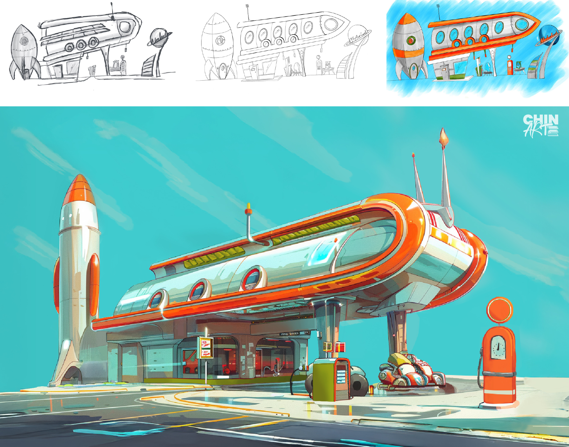
Phase 3: Concept Design — The Attraction Marquee
The marquee is the primary piece of attraction signage. In a real park environment, it is the element guests see first, often from a distance, before they can read any text. It has to communicate the identity of the space at three different scales: from across the street, from ten metres, and from arm's reach.
The design process for the Nebulunch marquee started with rough compositional sketches exploring different structural typologies. A tall pylon sign, consistent with Googie roadside signage, was the direction that best served the narrative: Carmen's idea, built to be seen from the highway. The orbital ring element and the fuel grade panels below, Cosmic 95, Galactic 98, Solar Fuel, are wayfinding and world-building at the same time. They tell you what this place sells before you read the name.
The final vector artwork resolves the typographic hierarchy, the dimensional form of the main panel, and the colour relationships between the sign elements. The custom script lettering for "Nebulunch" was developed to feel like a hand-painted sign from the era, with enough weight and contrast to read clearly at distance and in varying light conditions.

Phase 4: Wayfinding System
A themed wayfinding system does two things simultaneously: it helps guests navigate, and it deepens their immersion in the world. Every sign is a prop. Every sign is also functional infrastructure. The moment wayfinding breaks the visual language of the environment, the spell breaks with it.
For Nebulunch, the wayfinding system was developed as a family of sign types sharing the same visual DNA: the boomerang shapes, the starburst details, the consistent typographic treatment, the colour coding by function. Primary directional signs use the suspended boomerang form. Room identification uses the inline block lettering style. Destination signs use the layered tab format seen in the Terrace, Cocktail, and VIP Room panels.
The system works because every sign looks like it was made by the same hand, in the same era, for the same world. That coherence is not accidental. It is the result of defining the visual rules in Phase 2 and applying them consistently.

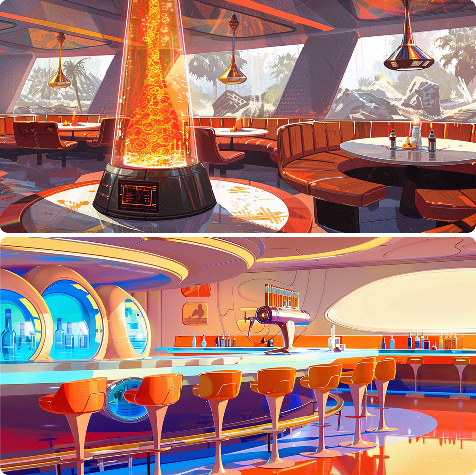
Phase 5: Interior Concept Art and Environmental Props
In themed entertainment, the designer's responsibility does not stop at the signage. The full guest experience includes every surface, object and detail in the space. In the concept and schematic phases, the team produces interior concept art to communicate the intended atmosphere to clients, producers and fabricators.
For Nebulunch, the interior concept art establishes the spatial experience of the restaurant: the lava lamp as the centrepiece of the dining room, the bar with its porthole windows and chrome stools, the warm amber light against the turquoise and orange palette. These images are not illustrations. They are spatial arguments. They say: this is what it should feel like to stand inside this world.
The prop design follows the same logic. The lava lamp was developed in four variations, each adapted to a different spatial context: table, ceiling pendant, wall-mounted and freestanding. One object, one material language, one world. The design rationale includes a material specification note: silver metal with a chrome finish, consistent with the broader palette of the space.
Phase 6: Print Collateral and World-Building Assets
In a fully realised themed environment, print collateral, posters, menus, signage inserts, is part of the set. It reinforces the narrative, adds depth to the world, and gives guests something to discover. In WDI language, this is called show quality: the standard that applies to everything in the guest's line of sight, from the mountain to the rubbish bin.
For Nebulunch, the poster series serves this function. Each poster exists within the world's internal logic: a vintage travel poster advertising Nebulunch as a destination, a promotional piece for the Halley's Comet observatory tour. The illustration style is consistent with the broader art direction, flat vector with halftone textures, the same palette, the same typographic personality. The character art, Carmen and Miguel as the owners of the space, adds narrative depth without explanation. Guests who notice will understand more about where they are. Guests who do not will still feel the world is complete.


What this process produces
A themed environment design project is not a collection of assets. It is a system with a story at its centre. The marquee, the wayfinding, the props, the posters: each piece is a consequence of decisions made in the phases that came before. Remove the narrative brief and the art direction becomes decoration. Remove the art direction and the individual pieces become disconnected. The system only works when every element answers to the same story.
That is the standard I apply to every project, whether the client is a venue operator in the Middle East or a fictional pit stop on the edge of the Milky Way.

Let's talk?

Dublin, Ireland
+353 83 859 5437
Chin.arte.lucia@gmail.com
Pages
Projects
Follow me
© This is a creation of Lucia López-Viejo All rights reserved